MENU • MENU • MENU • MENU •

Rebranding for a behavioral healthcare agency based in northwest Washington.

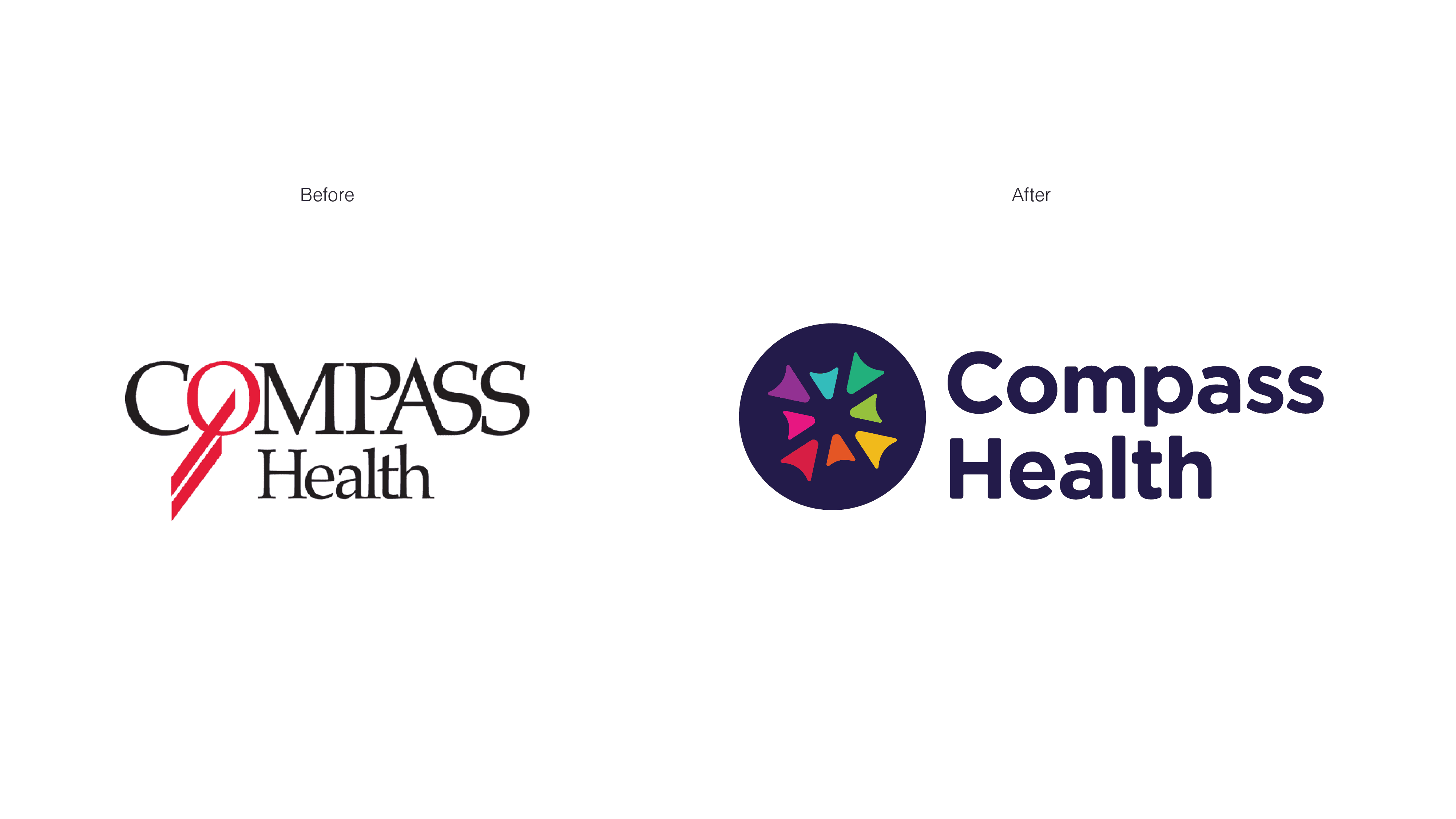
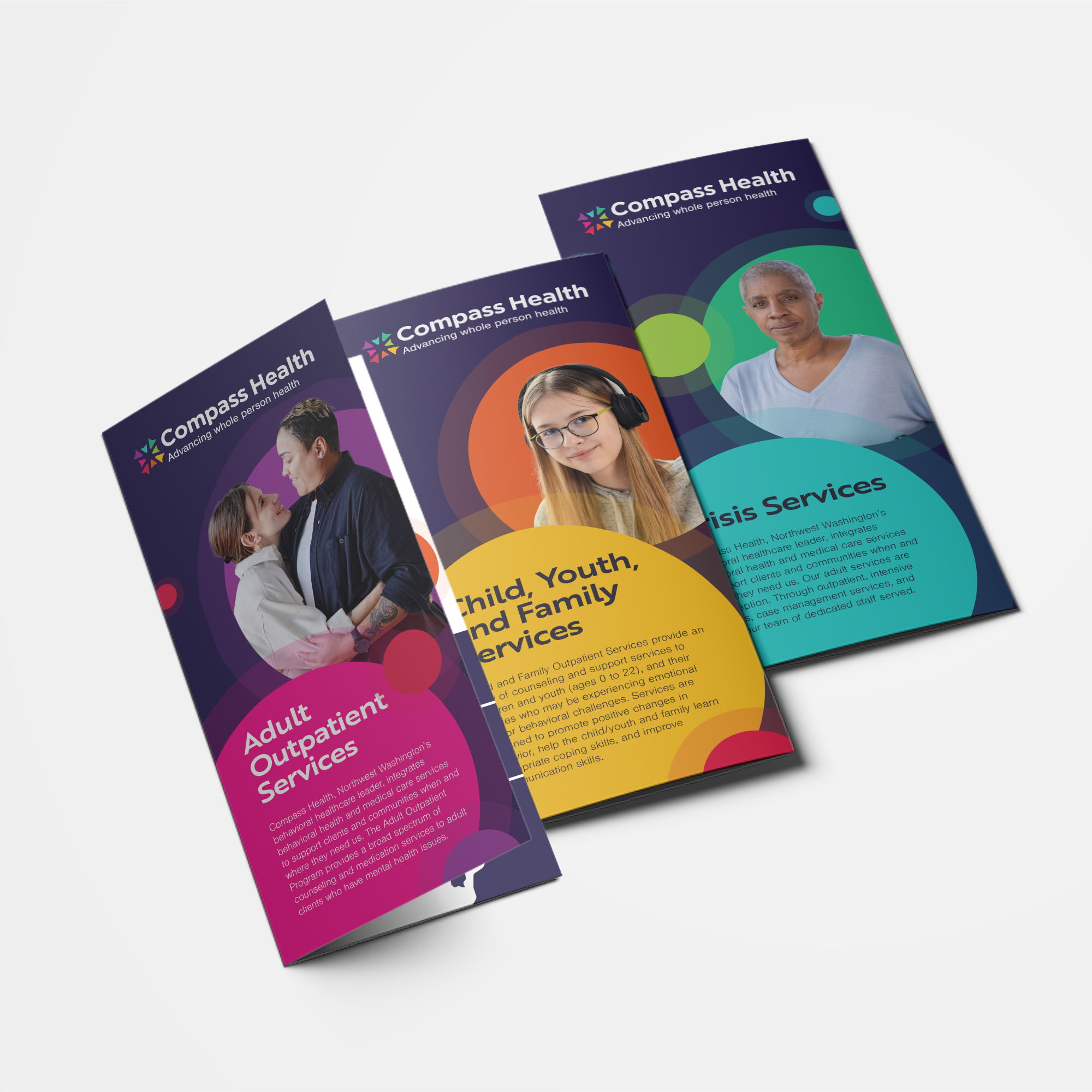
Compass Health is a behavioral healthcare agency serving people of all ages throughout five counties in northwest Washington. They wanted to update the brand to reflect over 120 years of growth and commitment to community.

Our team sought to create a brand that would help support the organization's DEIB efforts and provide flexibility for the spectrum of services they provide to various clients.

I was responsible for developing the rebrand’s visual identity as well as producing marketing materials and production files that would support the organization's new brand
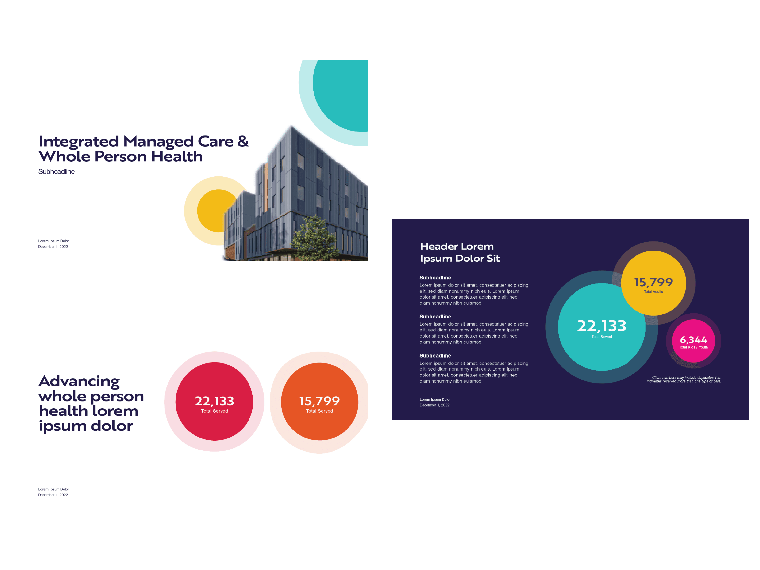
Deliverables

Branding

  • Visual identity

  • Style guide

Collateral

  • marketing

  • stationary

  • decks

  • production files

Creative Director

Timeca Briggs

Senior Designer

Erin Kayvedo

Production Assistant

Gavin Perry

Compass Health provides comprehensive behavioral health services to people of all ages, addressing a wide range of needs through specialized program areas: Child, Youth and Family Services, Adult Outpatient Services, and Crisis Services. Clients across Snohomish, Skagit, Island, San Juan, and Whatcom counties can access care through neighborhood clinics, by phone, or via telehealth. Each clinic is staffed by a team of counselors, psychiatric providers, nurses, and peer counselors, ensuring personalized, community-focused support. They are committed to accessibility, accepting Medicaid/Apple Health and many other health plans, as well as securing grants to serve uninsured clients.

Reflecting individual experiences, the greater community, and the paths in between

To ensure the new brand authentically reflected Compass Health’s mission and values, our team conducted in-depth stakeholder interviews and gathered organization-wide feedback through surveys. These efforts aimed to understand staff perceptions of their work, the brand’s reputation in the community, clients’ experiences, industry positioning, rebrand expectations, and organizational challenges.

The organization's stakeholders identified Compass Health's role as a guiding presence in behavioral health and survey feedback from staff expressed desire for a brand that is modern, unified, approachable, diverse, and conveys positivity.

To bring these aspirations to life, common themes of community, support, and cooperation are weaved throughout the visuality identity.

Logo System

The logo features individual shapes that come together to form a greater shape, symbolizing how individual clients belong to and contribute to their community. This iconic mark embodies the themes of community, support, and cooperation, with each shape contributing to the whole. The negative spaces between these shapes form paths that lead to and away from the center, representing a client’s journey toward connection and support while retaining the freedom to move forward independently.

Icon Set

To simplify the range of information and services available, stylized icons were developed that feature soft lines and round shapes.

Typography

Modern and inviting typefaces anchor the visual identity:

  1. The confident, yet approachable Brother XL give headlines and display text personality.

  2. Nimbus Sans, which adds trust and professionalism while still being soft in body copy.

The brand’s typography combines clean, modern aesthetics with legibility to ensure clarity across all communications.


Brand Color Palette

The brand colors are expressive and inclusive, reflecting Compass Health’s DEIB (Diversity, Equity, Inclusion, and Belonging) initiatives. The main colors represent the organization as a whole, capturing its mission and the three categories of services they offer. The remaining colors support additional palettes across marketing collateral, making it easier to navigate the organization's spectrum of services.

Secondary Palette

The supporting colors distinguish each service category and make navigating care easier for clients.

Collateral that Flexes and Scales

Compass Health’s collateral system is designed for flexibility and scalability. Designs accommodate varying lengths of service and location information, ensuring consistency while adapting to content needs. Color-coding helps differentiate the different service areas, and concise, scannable layouts make it easy for clients to find relevant information quickly. On brochure racks, this system creates an intuitive experience for clients navigating Compass Health’s offerings.

Branded Templates

To complete the marketing toolkit, I designed a presentation deck template. The circular elements, color palette, and image treatment come together in a variety of layouts for Compass Health to suit their needs.

Brand Guidelines

The organization's rebrand is summarized in one document that the whole team can collectively refer to. It provides clear, actionable directions for maintaining consistency across all applications, ensuring the identity remains cohesive as it evolves with the organization.

Brand Guidelines

The organization's rebrand is summarized in one document that the whole team can collectively refer to. It provides clear, actionable directions for maintaining consistency across all applications, ensuring the identity remains cohesive as it evolves with the organization.

Brand Guidelines

The organization's rebrand is summarized in one document that the whole team can collectively refer to. It provides clear, actionable directions for maintaining consistency across all applications, ensuring the identity remains cohesive as it evolves with the organization.

Brand Guidelines

The organization's rebrand is summarized in one document that the whole team can collectively refer to. It provides clear, actionable directions for maintaining consistency across all applications, ensuring the identity remains cohesive as it evolves with the organization.

Brand Guidelines

The organization's rebrand is summarized in one document that the whole team can collectively refer to. It provides clear, actionable directions for maintaining consistency across all applications, ensuring the identity remains cohesive as it evolves with the organization.