

Mental Health Education Curricula Website
Design System, Website Design
Website design for mental health education curricula library

A Seattle-based non-profit dedicated to the advancement of mental health education and care developed a beta website with the support of the University of Washington SMART Center. The beta website included a library of programs for mental health education in schools that were researched, tested, and analyzed by the SMART Center based on criteria borrowed from the Washington State Office of the Superintendent of Public Instruction. They were seeking to redesign the beta website to include library search features for teachers and attract donors to support the growth of the library.
As the Senior Designer at Conflare, I worked directly with the Creative Director on UX strategy and led the visual design of the website. The goal was to establish the redesigned website as a credible and accessible resource on mental health education and provide the foundation for the library to expand.
Conflare Credits:
- Timeca Briggs, Creative Director
- Randy Steiger, Technical Director
- Jon Hecky, Developer
- Yaw Asare, Developer
- Timeca Briggs, Creative Director
- Randy Steiger, Technical Director
- Jon Hecky, Developer
- Yaw Asare, Developer
Visual Direction
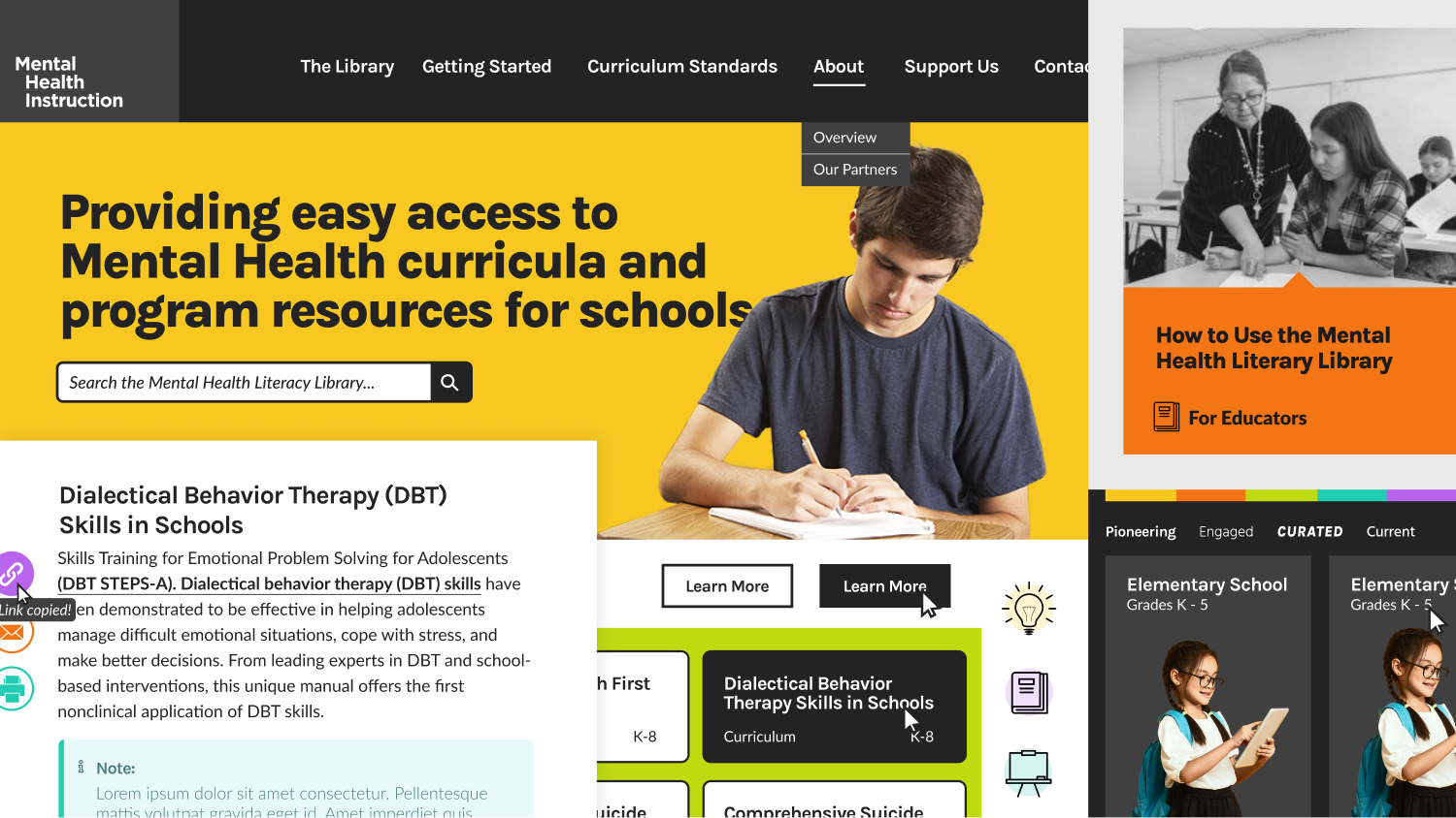
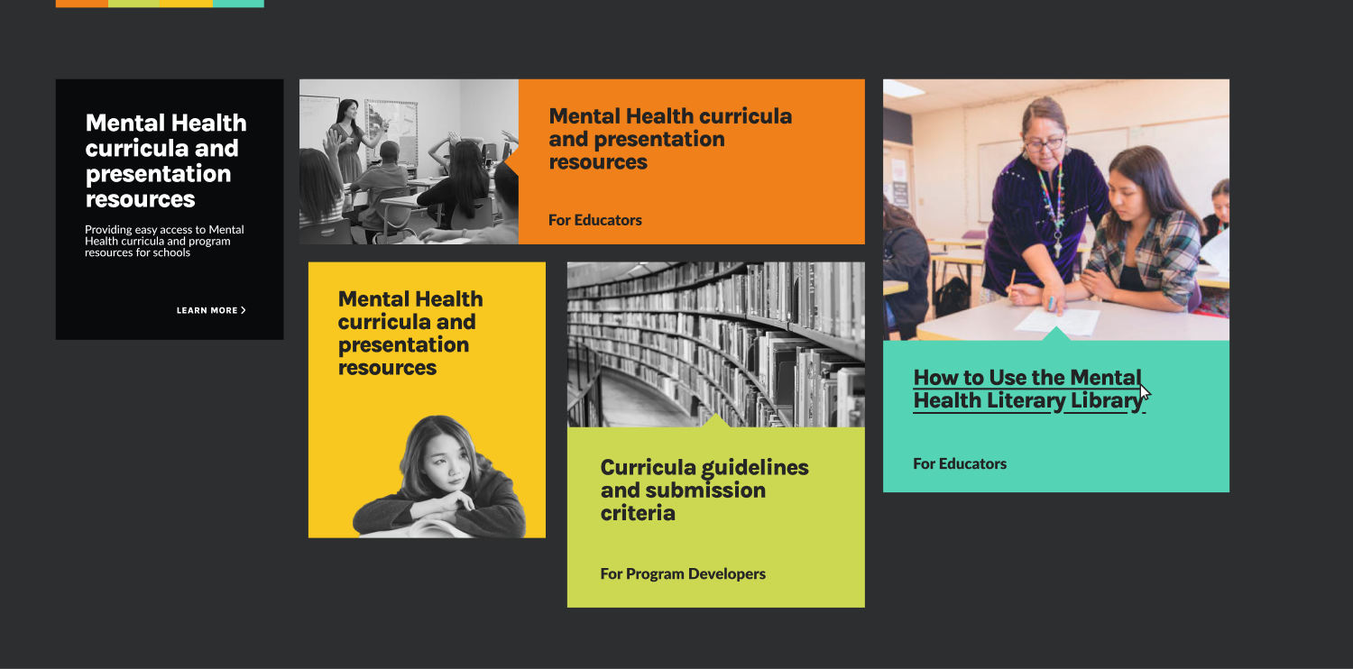
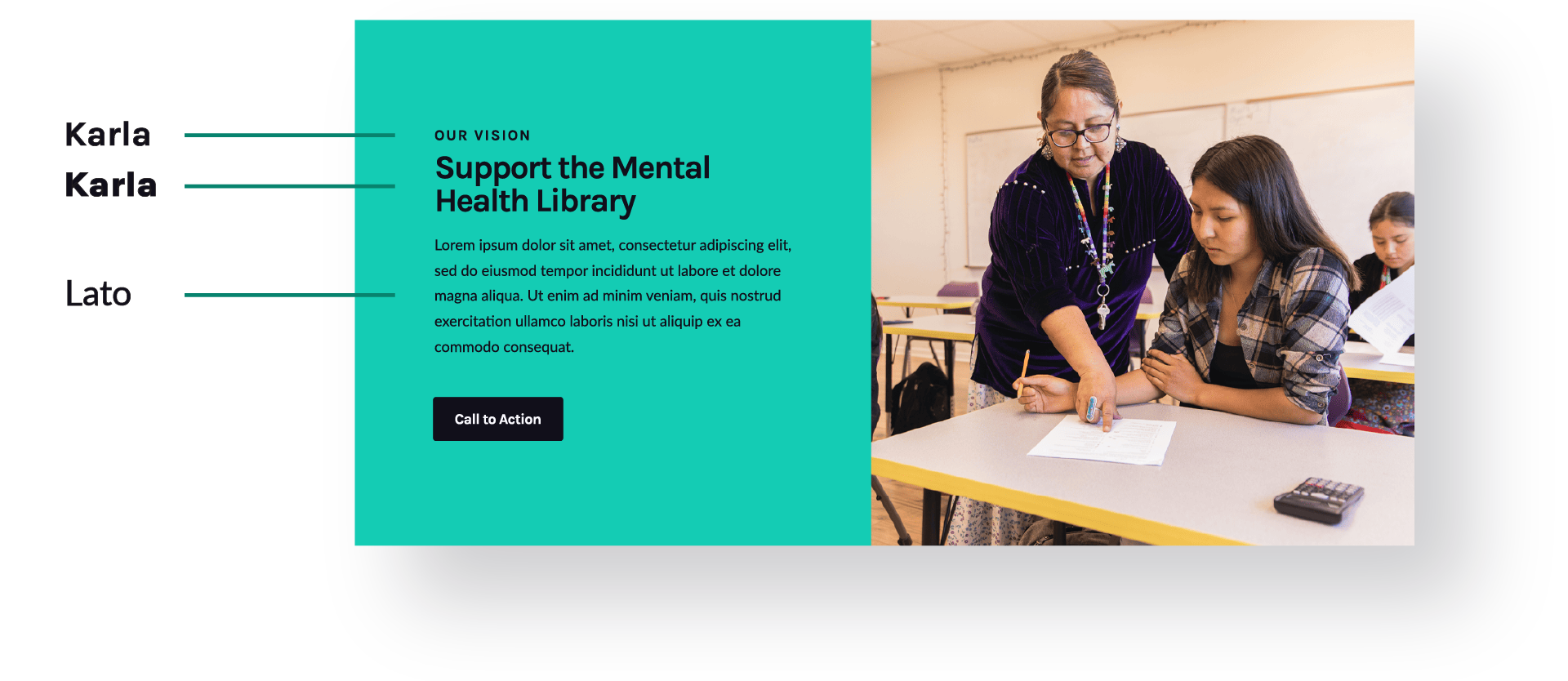
During the style tile process, I explored a visual direction that was modern and engaging with areas of color blocking to make dense text digestible. The colors are energetic and forward-thinking, which represent the pioneering nature of Mental Health Instruction and its library. The imagery shows students and teachers that are invested in what they’re doing. The headers feel approachable and the body copy is easily scannable, balancing readability with personality. This direction opens up the design to feel inviting and accessible while providing the foundation for thorough documentation.
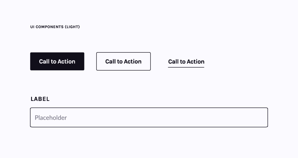
Design System
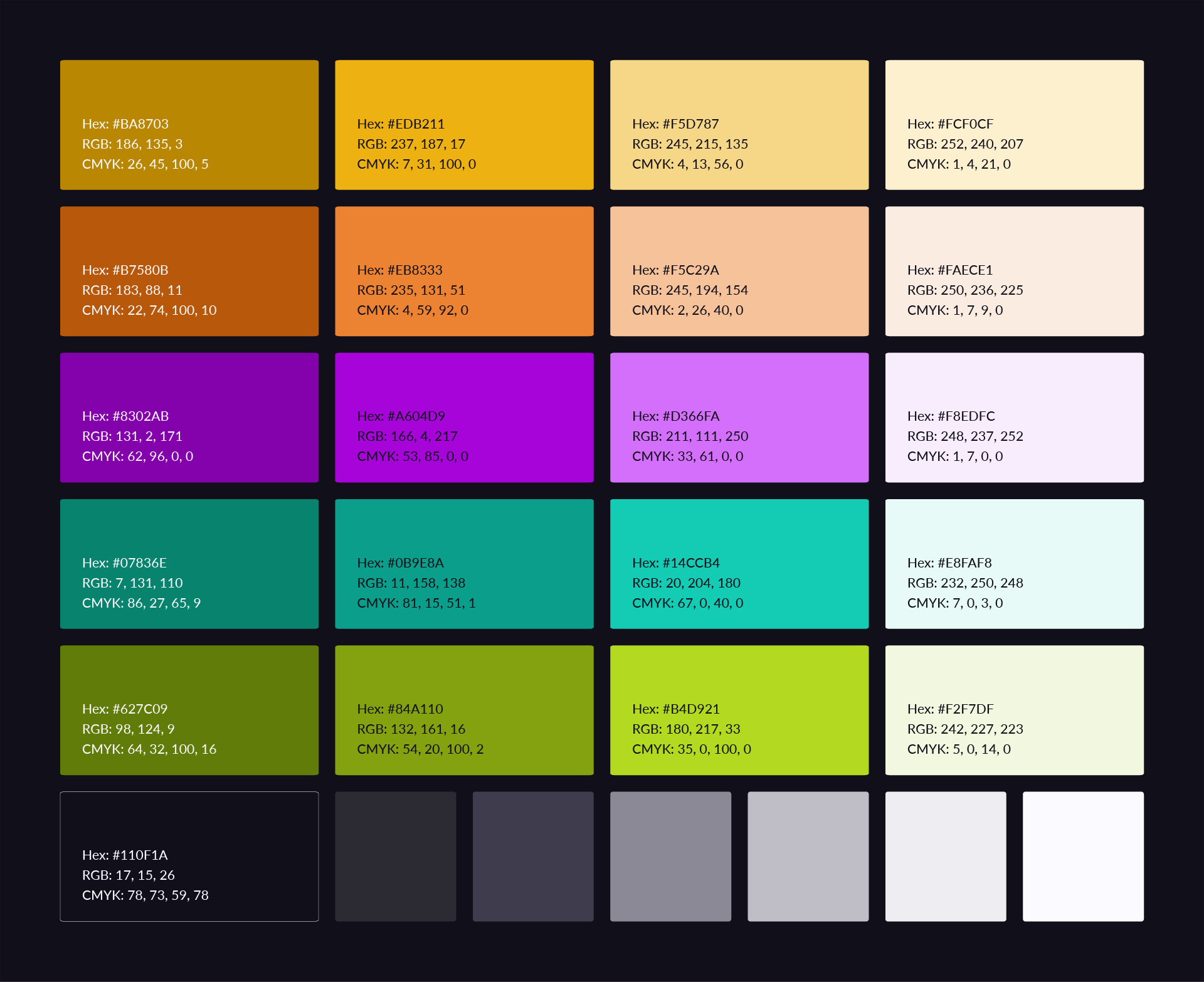
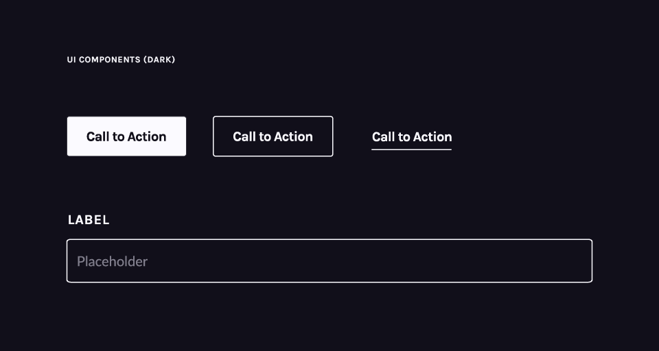
After the visual direction was established, I expanded on elements presented in the style tile to develop a comprehensive set of design guidelines and components. The color palette was refined to include base accent colors, and color combinations were evaluated for accessibility using WCAG 2.1 AA and AAA contrast criteria. Typography was analyzed across small, medium, and large screens to determine the ideal size to leading ratios at different breakpoints and establish styles for hierarchy. Global UI components like buttons, forms, accordions, and cards were standardized for light and dark themes to accommodate the variety of color blocking throughout the design. These guidelines allowed visual elements to be flexible and adapt to accommodate different content throughout the website design.

Mockups
Using the style tile and design system as a reference, I translated wireframes into high-fidelity mockups that showcase the visual direction in context. Throughout the process, I collaborated closely with Conflare’s creative director and developers to gather feedback and iterate on the designs.

The redesigned site highlights all the work that has been done to curate the library so far and the support needed to expand it. The library includes new filters and a comparison feature to make searching for mental health curricula easier.


